Color Theory in Interior Design with Nature Photography
Preview any of my fine art photographs on your wall with a custom mockup created from your room photo. This free service helps you choose the perfect artwork, size, and frame with total confidence.See Exactly How My Fine Art Prints Will Look in Your Space
Color is a powerful element in interior design and the way we decorate our space. It can influence our emotions, giving light to a room that otherwise might seem dull. Using color as a factor in picking a fine art photography print isn’t just about wall decor. It can totally transform a room and define your interior design style. I created this color theory guide to help you understand various key color theory principles and how you can apply them when choosing fine art nature photography prints. By the end, you’ll be able to use and understand color like a pro, creating an interior that not only looks harmonious but resonates with the atmosphere you want to create for your home or office.
Understanding Color Theory Basics
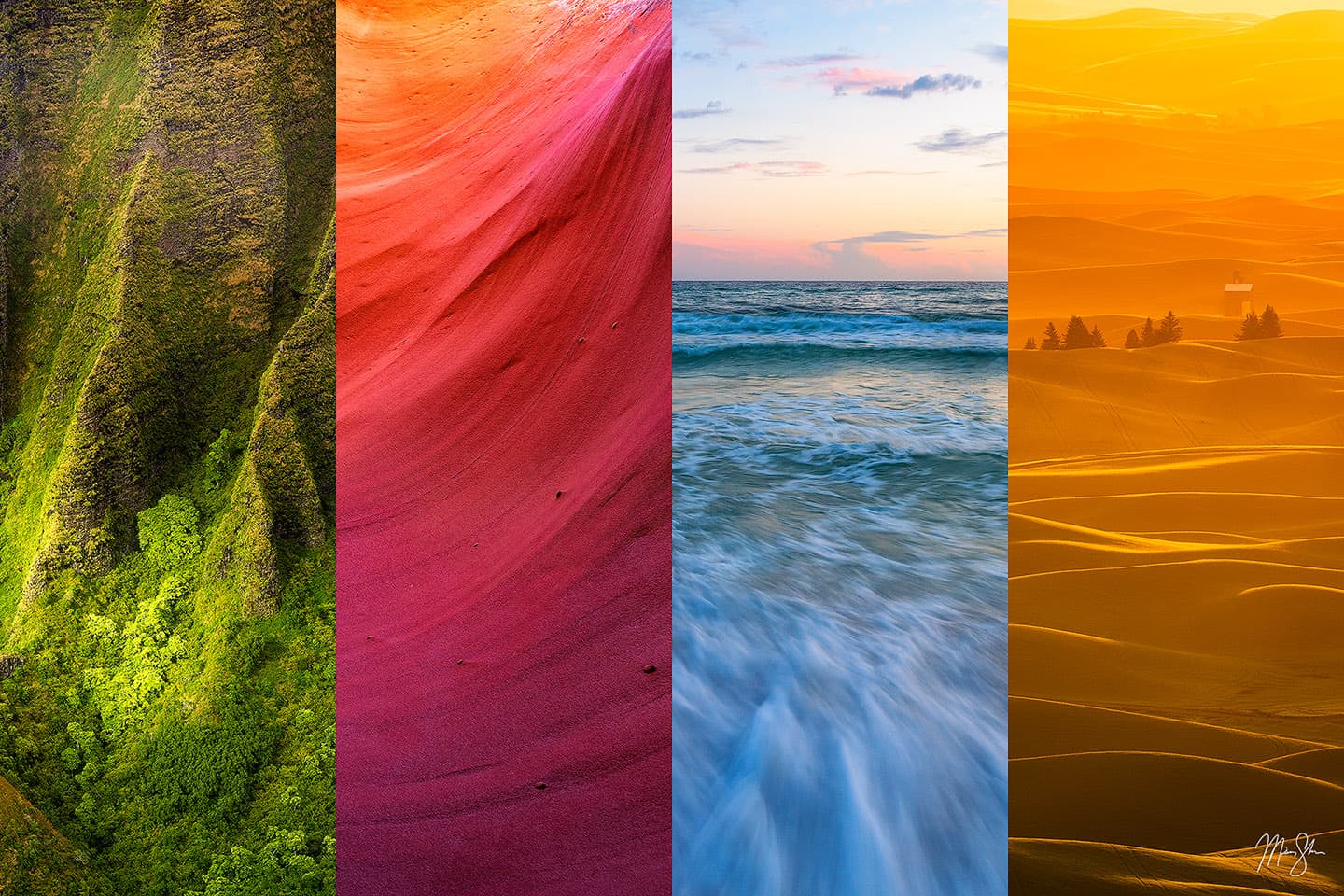
Color theory can be defined as the art and science of using color. It can help designers understand how hues are related and how you can combine them for desired effect. At the heart of color theory is what we call the color wheel. The color wheel is a spectrum of colors represented on a circle that can help us visualize relationships between the various hues. This was originally conceptualized by the famous Sir Isaac Newton. From the color wheel we get several fundamental color scheme concepts:
Analogous Colors
Hues that are next to each other on the color wheel tend to create a unified and harmonious look. This is known as an analogous color scheme. Examples of analogous colors would be green, green-blue and blue or red, red-orange and orange. Within an interior design setting, using an analogous approach would mean having a space where your art and the room share a similar palette of colors that creates a cohesive and harmonious space. An example would be a room that is decorated in green tones with fine art print that showcases a nice forest scene with greens and blues in it.
Complementary Colors
A complementary color scheme uses hues that are opposite of each other on the color wheel to create a strong visual. Whether you are using traditional models (Yellow/Purple, Red/Green, Blue/Orange) or a more modern model (RGB & CMY), complementary colors rely on using opposing color pairings to create a high contrast scene. By using these opposing colors, you can make the artwork in your space “pop” as a focal point of the room, often creating a very vibrant overall feel. Nature photography with complementary colors tend to be statement pieces. Picking an image with lots of orange tones, such as a warm sunset would really stand out against a decor with blue tones. Each color complements the other, and in turn, intensifies the other making for a striking visual concept.
Monochromatic Scheme
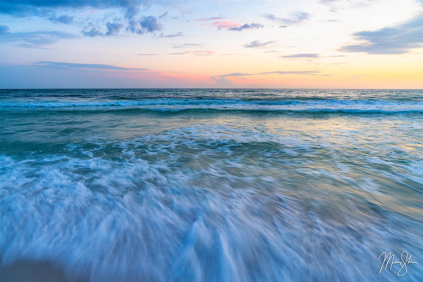
Using a monochromatic scheme, which takes one base color in varying shades, tints and tones, you can create a very sophisticated feel to your decor. The result is a very elegant and cohesive look that’s also subtle without the need to introduce new colors. A good example would be decorating a room with various blue hues such as sky blue, navy and teal and pairing it with the artwork below. The Destin, Florida seascape scene shows a cooler-toned sunset with predominately blue hues that would create a calm atmosphere in a room with cool toned colors.
By understanding these color schemes, you can choose fine art prints that makes a specific statement in your decor. Whether that is art that blends with your interior palette or boldly contrasts and stands out, interior designers will often rely on these color harmony rules to create a balanced space. Understanding how the analogous (harmonious), complementary (contrasting) or monochromatic (subtle and understated) schemes work, you can start deciding how you want your art to fit within the colors of your room.
Color and Mood: Warm vs. Cool Tones in Art
Before diving into matching specific colors it is worth considering whether the temperature of the colors in the artwork are warmer or cooler. The color temperature in a room has a profound effect on the mood and energy of a room. Cool colors such as blues, greens and purples typically work to calm and refresh, creating an atmosphere that is more relaxed and tranquil. Contrasting that are warm colors like reds, oranges and yellows that tend to be powerful and vibrant and often evoke feeling sof excitement, warmth and happiness.
If you are thinking about this in practical terms, consider the function of each room. Warm hues are often used in spaces like dining rooms and living rooms to stimulate conversation. These are rooms that you often want to stimulate conversation and make a space feel inviting and energizing. Picking a fiery sunset or autumn leaves will greatly benefit rooms like this.
In contrast, cool-toned art might be better suited for a bedroom or home office where you are trying to create a soothing and relaxing feeling. Think artwork like a lush green forest scene or a blue seascape. Using these colors in your design can be perfect for rooms where rest and reflection are important.
The Meaning Behind Colors
This brings up the next point: Color Psychology. It’s helpful to understand color psychology and what each color means that way you can use it to influence emotions and mood in your interior design spaces.
Red: Power and Strength
Red is often used to convey power, energy, passion and strength. When you see a splash of red in a nature photograph, such as a dramatic sunset or red flowers, it can draw attention and add excitement to a room. (think red flowers or a dramatic sunset) can draw attention and add excitement to a room. Red tones are bold, so they work well in moderation or as focal points to avoid overwhelming a relaxed space.
Orange: Warmth and Energy
Orange is a great color to bring out warmth, enthusiasm and energy in a room. It can be used for bold statements or creating a stimulating atmosphere.
Yellow: Happiness and Brightness
Yellow signifies happiness, energy and is associated with optimism and intellect. A golden sunrise or a sea of yellow sunflowers can brighten up a room both visually and emotionally. Much like orange, yellow is great for a kitchen or space where you want to encourage friendliness and optimization as it exudes warmth, cheerfulness and creativity.
Green: Nature and Rest
Green is often regarded as the most restful color for the human eye. It is also the color of nature itself. It is usually associated with growth and balance. Using green, such as foggy forest scene or green rolling hills can instill calmness and balance in a room. It can be a great way to a touch of peace to a room as well.
Blue: Calmness and Tranquility
Blue is almost always associated with stability, calmness, wisdom, trust and loyalty and is often considered the most popular color in art and design. From the blue skies above to the turquoise waters below, blue elements in a photograph bring a feeling of openness and calmness to yourspace. Deeper shades of blue add depth and elegance, while lighter shades tend to be incredibly soothing and are usually ideal for bedrooms.
Purple: Luxury and Creativity
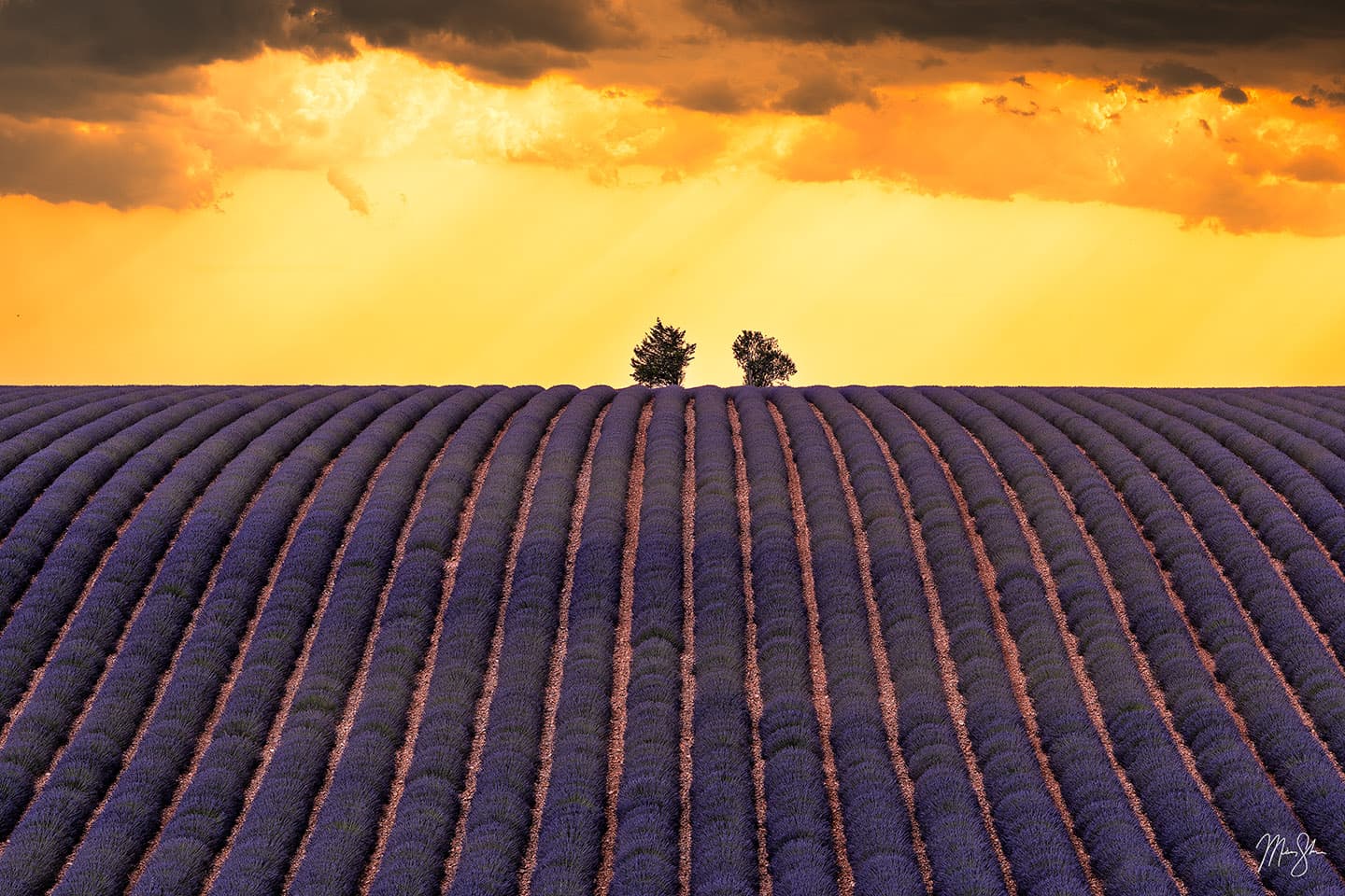
Purple evokes feelings of luxury, creativity, sophistication and even royalty. It mixes the energy of red with the calmness of blue. A lighter purple, such as a Provence field of lavender tend to be softer and more gentle, while deep and dark purples such as a vivid deep purple sunset can create strong emotions of luxury and power.
Knowing what these colors mean can help you decide what emotional tone you want to set for your room or space. If you want a calming and restorative room, you might select art dominated by greens and blues, such as a seascape, mountain lake scene or peaceful waterfall. If you desire a warm and energetic feeling in a room, consider images with warm colors like reds, oranges and yellows, such as an autumn forest or dramatic sunset. Whether you are trying to plan a space around a piece of artwork, or choosing artwork to fit a space, the key is to make sure the artwork and atmosphere of the room should support each other.
Matching Your Art to the Interior Color Scheme
The next step is taking a look at your room’s existing color scheme. What are the dominating colors of your space? What color are the walls? What about the furniture and decor? Here are two strategies to think about when incorporating nature photography into a room’s palette that offer either complement or contrast.
Harmony: Echo the Room’s Colors
One popular approach to matching up your interior design with your artwork is to choose a photograph that will compement or match the colors of your existing space. This doesn't mean you have to use the same shade in everything, but selecting artwork that should feature one or more dominant hues from your room's palette. Going this route will make the art feel like a natural extension of the room's current design. For example, if soft blues and grays dominate your dining area, picking a seascape or misty blue mountain print will echo the tones, reinforcing a nice, calm cohesion. For instance, if your living room is decorated in soft blues and grays, a seascape or a misty blue mountain print will echo those tones and reinforce a calm cohesion. Take my photo Adrift above, it would fit into a palette like this perfectly. Picking a photo that already contains colors similiar to your room's main hue (using analogous colors) is the simplest path to a cohesive look. The result gives you a room that is subtle and sophisticated with the art and decor blending together in harmony. You can also pull a secondary color from the art to use as an accent color within the room. For example, if your landscape photo heavy on yellow and reds like an autumn scene with a warm sunset, you could add a yellow rug to the room, tying it all together perfectly.
Contrast: Creating a Focal Point That Pops
Alternatively, the other approach is to deliberately contrast the colors of the room with your art. Because complementary colors are opposites, by selecting a piece that contains a complementary color to your primary decor color, the art will stand out as a bold focal point. For example, in a room with predominant teal-blue decor, an image of a brilliant orange sunset or autumn leaves can really pop. By using these complementary colors, you are injecting energy into the room and drawing the eye directly towards the art. Using contrast like this creates a vibrant focal point that energizes and add personality to monotone decor schemes. This can be a great way to present your fine art piece to be the star of the show. The only caveat to this method is to make sure it's done intentionally with a room palette that is relatively simple. When using bold complementary colors, you don’t want too many clashing elements. Placing contrasting artwork creates a focal point that directs the eye and commands attention without overwhelming the space.
Both of these approaches are valid. You can even combine them in different measures. Some designers will start with one dominant color to match or harmonize the room and one accent color to contrast. The goal is to create a balanced palette. You want the art to blend in for a tranquil and unifed feel or have it stand out for an accentuated effect.
You don't need everything to be identical. Matching just means the colors are in the same family or complementary on the color wheel. On the other hand, contrast shouldn't mean chaos. It means that you are strategically using opposites to enhance the visual interest of the viewer. Neither of these approaches is better than the other, but make sure it fits the overall vibe you want. If you already have a lot of color in a room, picking a piece that harmonizes with the room might be the calming touch that's needed. If your room is a bit drab or neutral, you might select a contrasting and colorful print as that bold accent that's needed to bring excitement to the space.
Using Nature Photography as a Color Accent
One advantage that fine art nature and landscape photography prints have is the ability to bring a rich palette of colors that is derived straight from the beauty of nature. This can be harnessed as accents and anchors in your interior design, helping you bring the outdoors inside in a meaningful way. Below are some practical tips for incorporating nature photography into your color scheme effectively:
Identify Key Colors in the Art
The first step is to take a close look at the photograph you love. What jumps out to you as the dominate color? Second, what secondary or accent colors show in smaller amounts? Identifying these colors will help you in deciding which colors to highlight in your room. For example, if you were to look at my piece Plitvice Grande, the dominant color is green. You can also see greenish-blue in the water, along with a lot of white in the waterfalls themselves. Using the heavy greens, you could paint an accent wall a similar green. Then, use the whites and a blue from the lakes as pillows or small rugs. This makes use of the secondary colors as secondary colors, giving the entire room a coordinated look. By doing this, you make the entire room feel like it has been designed around the artwork, creating a high-end feel.
Use Accessories to Tie the Palette Together
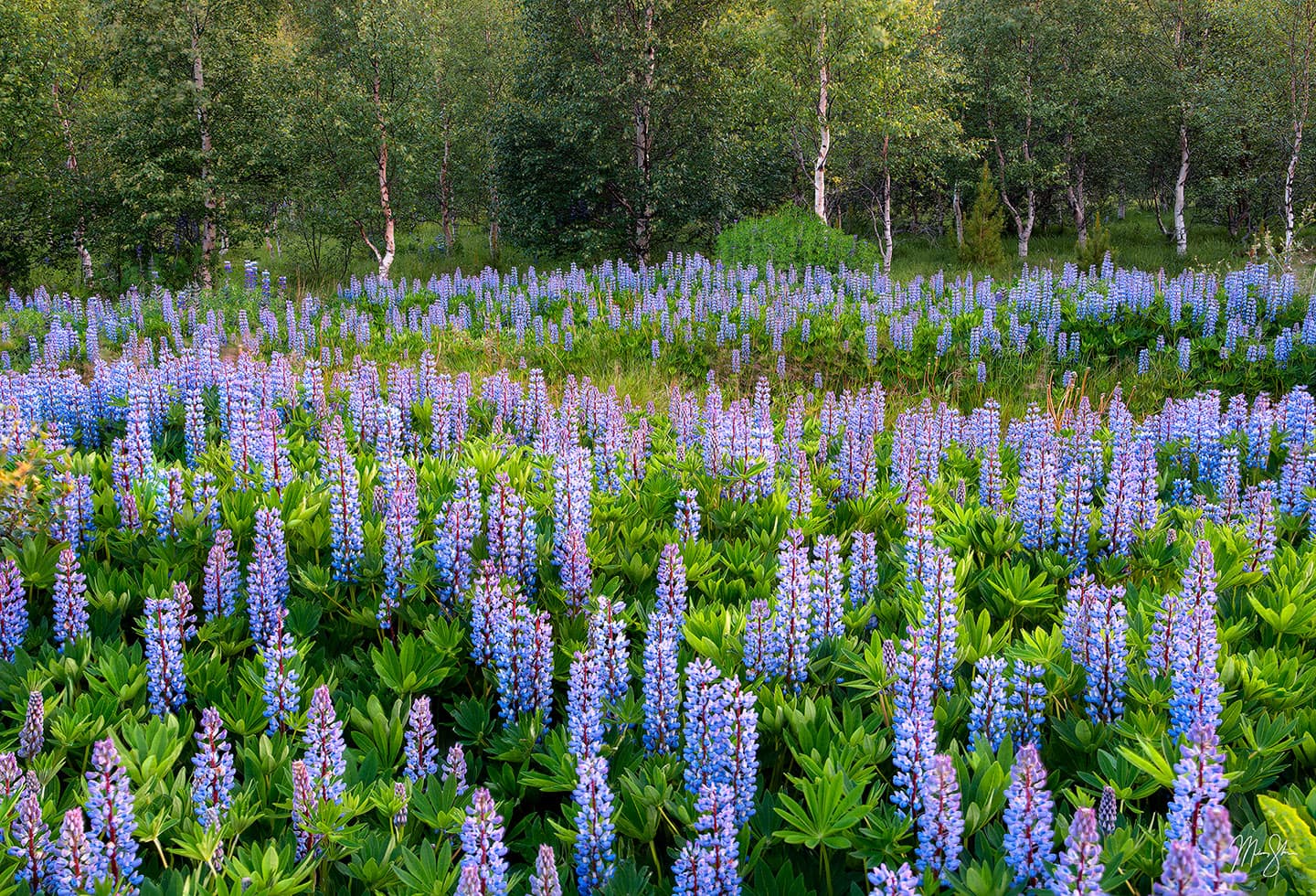
Designers often talk about repeating a color at least 2-3 times in a space to give it an intentional look. You can use your artwork to help with this. After hanging the photography, look at some colors within the piece for inspiration. For example, take my photo above titled 1:30 in Iceland. Let’s say you loved lupine flowers and picked my photo, 1:30 in Iceland, as a piece to hang in your living room. You could look to add a few throw pillows or vases in similar shades of blue as the lupines. This helps connect the artwork to the room’s decor so it doesn’t feel isolated while creating unity in the space.

Make the Art the Focal Point (if desired)
A large statement piece with bold coloring can serve as the room’s focal point by letting the artwork's colors guide the entire room's palette. Designers will often start a design scheme by choosing a stunning art piece and pulling wall and fabric colors from it. If you have a vibrant nature photograph, such as Firebolt, shown above, you could paint an accent wall in a complementary blue, which would make the photo pop. You could also keep the walls neutral and let the art itself speak for itself, providing all of the color.
The idea with this is to highlight the art. You want to immediately draw the eye with it. Ideally, surrounding it with colors that are more muted will make the artwork stand out. Keep in mind that hanging a vivid nature photography print on a slightly darker wall will give you maximum impact .
Blend the Art into the Palette:
Alternatively, you might want the artwork to complete the room without dominating it. With this approach, the piece simply reinforces some of the same colors already present in the room's scheme. A lush landscape with soft greens and blues would quietly complete a room that is decorated in slate and sage type tones and become a component of the palette rather than the singular focus. By doing this, you create a more subtle and tranquil atmosphere. In this design style, your art will support the design without overpowering it. This works very well in minimalist and modern interiors that are going for a clean and cohesive look. Going this route, the fine art print still adds interest and beauty to the room, but in a more understated harmonious way.
Consider Scale and Color Intensity:
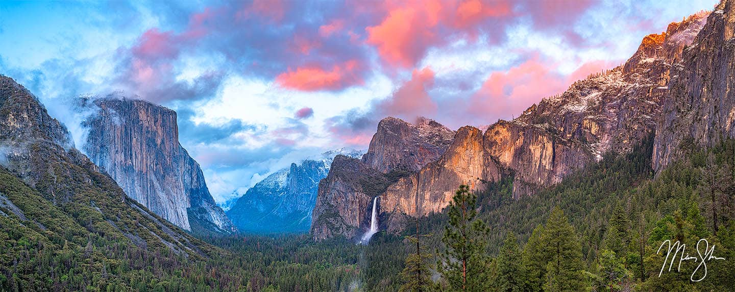
The size of your artwork and how intense and vibrant the colors are will have a heavy influence on how much it impacts your color scheme. A large print with bold colors will naturally become a centerpiece, so it's perfect to use as a focal point. Just make sure you balance it with a few softer elements around the room. As an example, let's say you hang a really big and vibrant landscape over a sofa like my image Yosemite Sunset Panorama that is shown below. You might consider pairing it with a sofa and surrounding decor in neutral or use subtle tones pulled from the photo’s background to make the room feel balanced instead of busy. Alternatively, in rooms that already have a lot of colors, picking a smaller print or one with specific color can add interest without overwhelming the design. Rather than a large and bold statement piece, using several small nature photos with coordinated colors can be grouped in a gallery-style. This allows the pieces to collectively act as a focal featured, sharing the color load with the room. The key is proportion. Echo a burst of color in art, but don't duplicate it everywhere. You want to maintain balance of the hue in your space.
Mind the Background (Wall Color)
Think of your wall as the canvas behind your canvas. The color of you wall, along with the brightness, affects how colors in your artwork appear. Using light, neutral wall colors will let the artwork shine. If your walls are dark or saturated with color, keep in mind how they will interact with the artwork. A bright image on a very dark will will give your artwork more "pop" due to the high contrast. Whereas that same piece of art on a light bright white wall will appear less intense in comparison. A brightly colored wall can reflect onto the artwork as well. Green walls might slightly tinge a white art border or image as light reflects off of it. This isn't necessarily bad, but it is something to think about. Many times, people will chose art after wall colors, but if you are flexible, you can usually tweak the wall's shade a bit to best showcase your new prized piece of art. You can use this to your advantage as well. As an example, a soft matte wall color that picks up one of the artwork's background tones and really set the whole presentation off, leaving it looking very polished and intentional.
Quality and Medium Matter
As a final point, investing in high-quality prints and finishes will truly make those colors sing. By chosing premium mediums like HD acrylic or metal prints, your fine art nature photography prints will have a luminosity and depth that standard, cheap poster prints just can't match. Metal prints will shine with vibrant and radiant colors due to the process of how they are made. Your blues, greens and reds will appear especially vivd and sleek and give your interior a comptemporary look that is both modern and vibrant. Similiarly, acrylic prints offer rich color and a gallery-like finish that has insane depth and detail. Acrylic prints have an almost 3-dimensionality and richness in color detail to them that no other print medium offers. Picking a medium like this means your colors won't easily fade and your investment piece maintains that lasting impact over time. Museum-quality printing and mediums will do the photograph's colors justice and ensure your art becomes a stunning visual anchor in your design rather than just an afterthought.
Bringing It All Together
Color can be used as the connecting thread between your interior design and your artwork when used thoughtfully. Always start by considering what mood and palette you're going for in your space. Then select a fine art nature photograph that will embody those colors and feelings. Remember that you can either harmonize with your current decor colors for a serene and cohesive look, or you can go with a contrasting feel for a bold, statement-making effect. You can also do a bit of both. Don't be afraid to play around either. It's often about finding the right balance. Do the age old test by holding up color swatches. Or if you are trying to place the artwork in your existing space, use my digital mockup services with art on the wall to see how the hues will interact.
Ultimately, whatever resonates with you personally is ultimately the best art choice. Color theory can guide you in creating visual harmony, but your emotional connection to a piece matters just as much, if not more! If a photograph captivates you and will fit into the general palette of your room, it will feel right at home on your walls. If you trust your gut, that piece that speaks to you will always find its place and naturally bring you joy in your decision.
In conclusion, if you get a decent grasp of color theory, it will go a long way in helping you pick out the perfect landscape or nature photography print for your walls. By being mindful in regards to how the colors complement or contrast and how they will affect the ambiance, you'll create a space that both looks beautiful and feels like a perfect fit for your interior. Whether you choose the calming blues of a seascape in your bedroom or the energizing reds and oranges of a sunset in your office, the right colors in art will transform your environment for the better. Go ahead and explore those fine art nature photography prints with an eye for color and have fun designing your own harmonious and inspiring space!
Bring Color Theory Into Your Space
Are you designing an interior and want artwork that will complement your color palette, lighting and mood? I offer personalized guidance and free visual mockups to help you visualize the right fit.